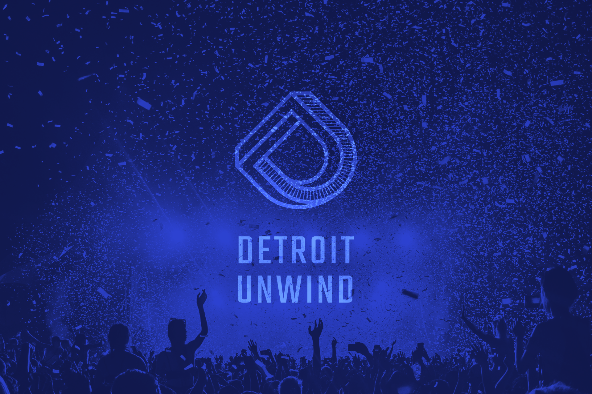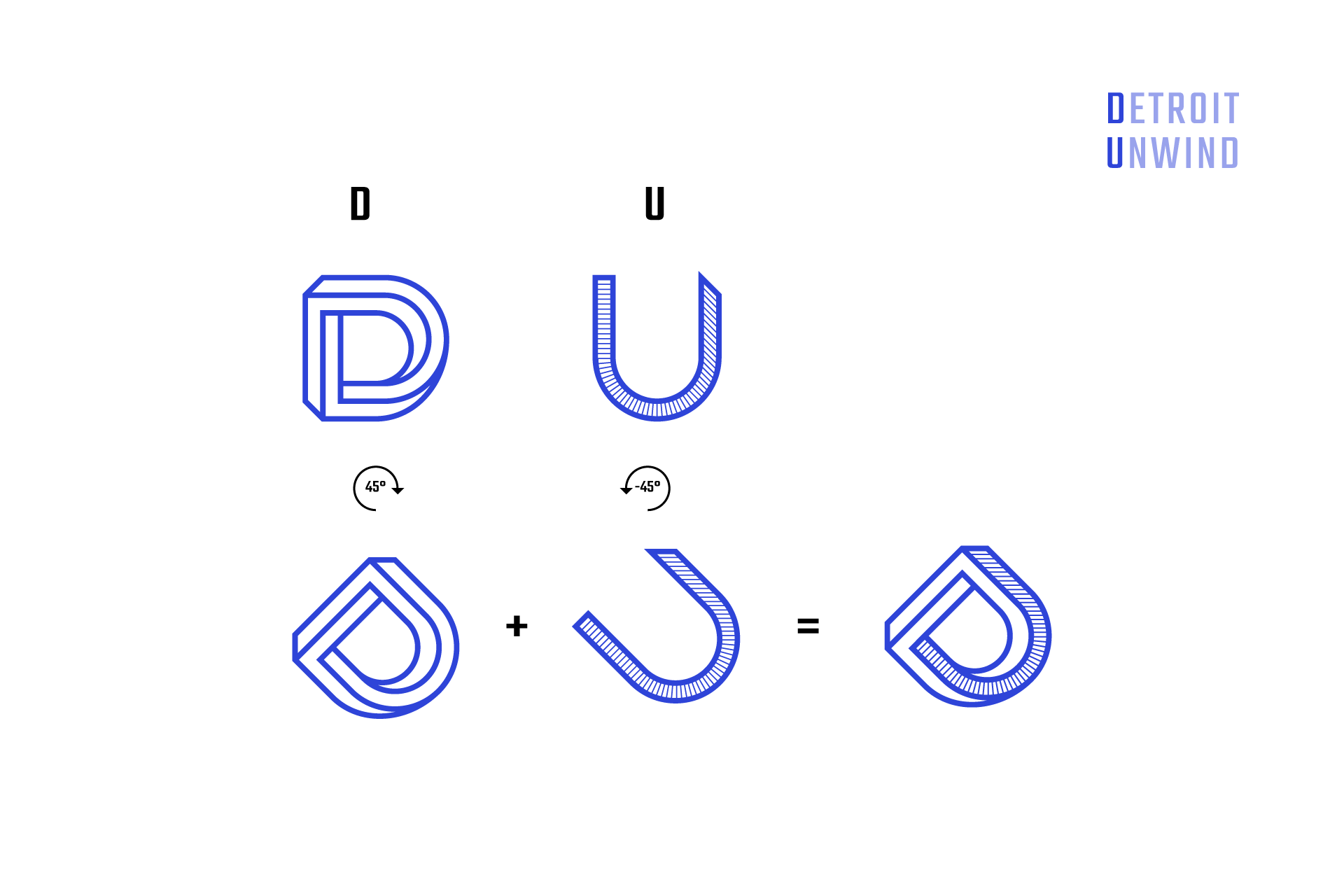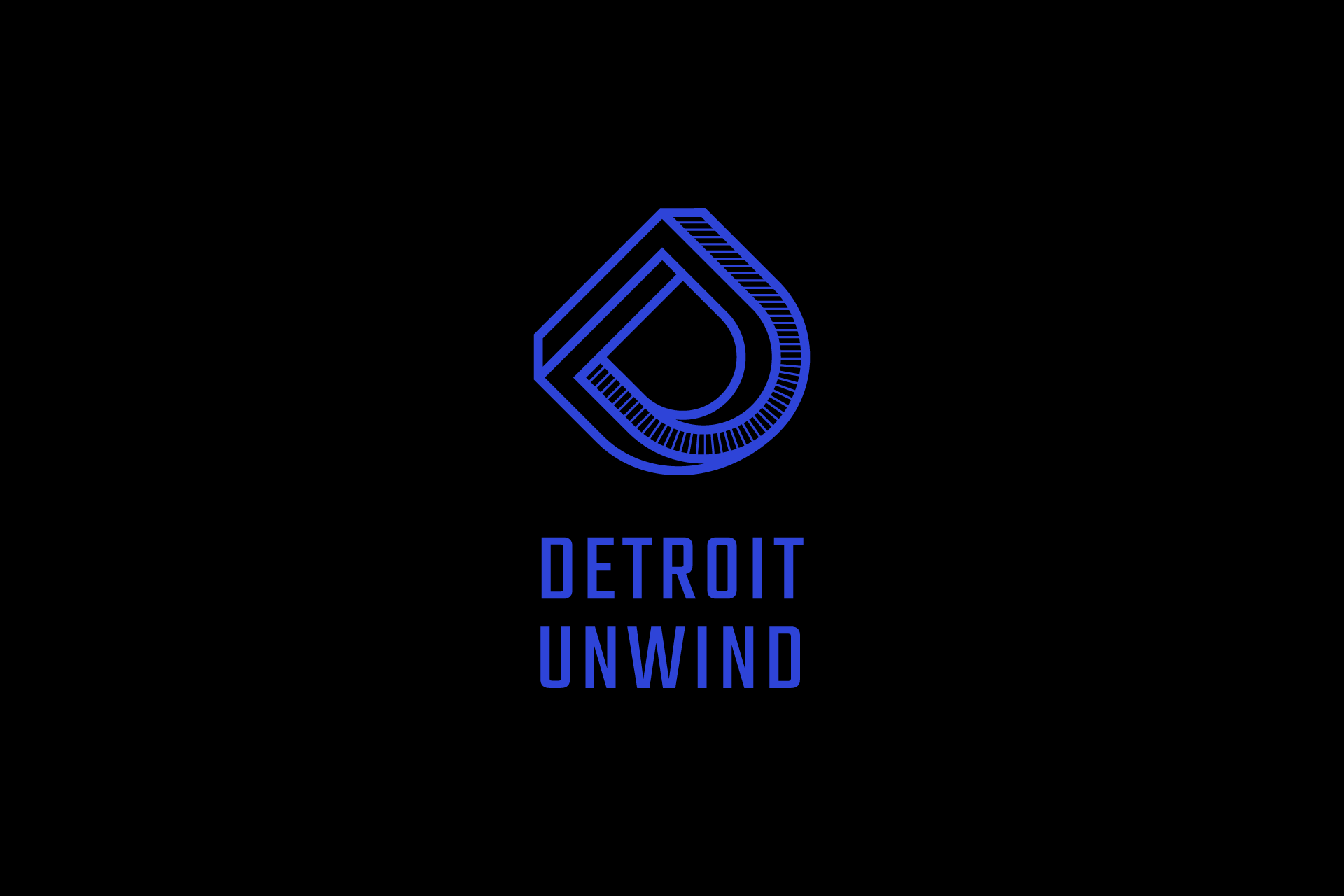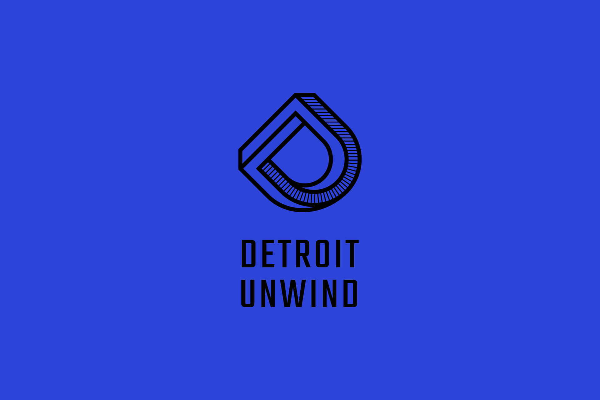
Graphic design / Visual identity
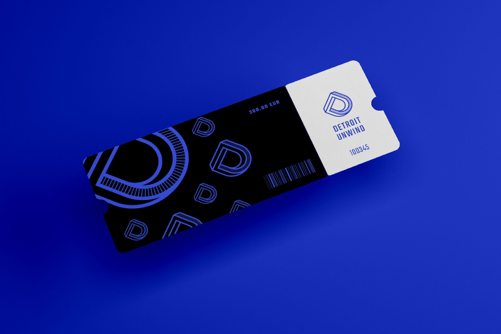
Visual identity concept for the music festival based on the first two letters of the name. Letter D is formed in an "impossible" perspective and shading one of its planes creates letter U. Letters are rotated 45 degrees in opposite directions, which allows them to remain recognizable while looking more dynamic and connected.